EDITORIAL UX: ARTICLE, BLOG, LISTICLE, LONG-FORM
GOLFDIGEST.com Redesign
Webby Awards 2016 Best Websites Sports Honoree
Golf Digest is #1 most widely-read golf sport publication in the world. Its official website, GolfDigest.com, has over 1 million digital audiences.
Golf Digest is the authority on how to play, what to play and where to play. The website redesign represents the brand's voice and transforms it into a more digestible digital reading experience with a rebranding visual look. The new website is responsive and supports all devices from desktop, tablet to mobile.
Date: 2015
UX Design: Yanwen Hu
Visual Design: Aaron Braun
Skills:Information Architecture: Data Analysis, Content Mapping User Experience Design: User Flow, Wireframe
UX Design
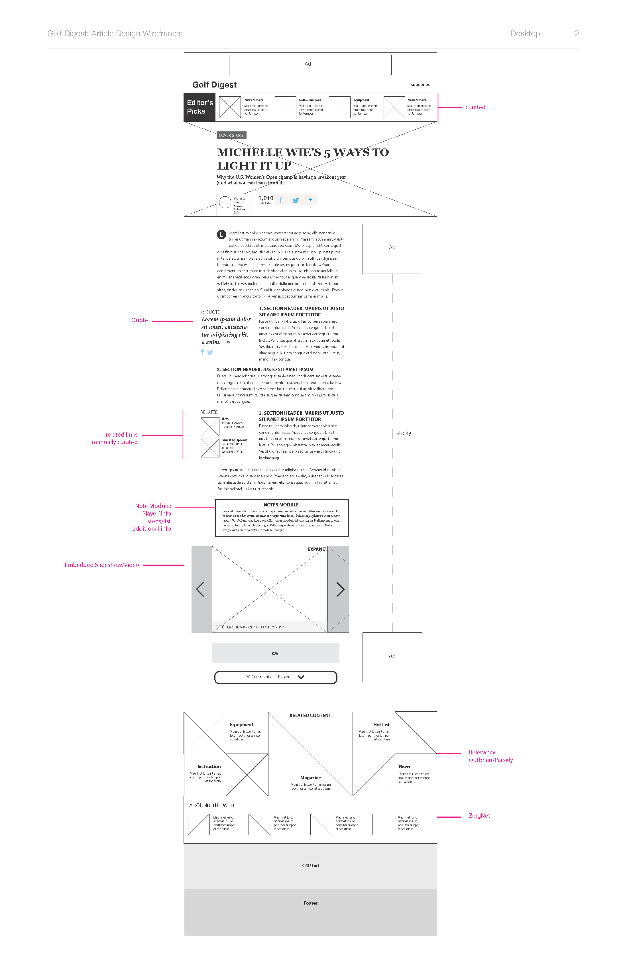
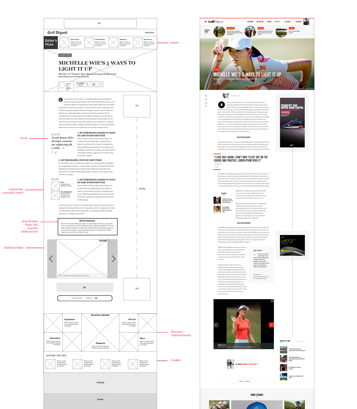
ARTICLE
Curated and Evergreen
Golf Digest's timeless content, golf equipment, instructions and courses
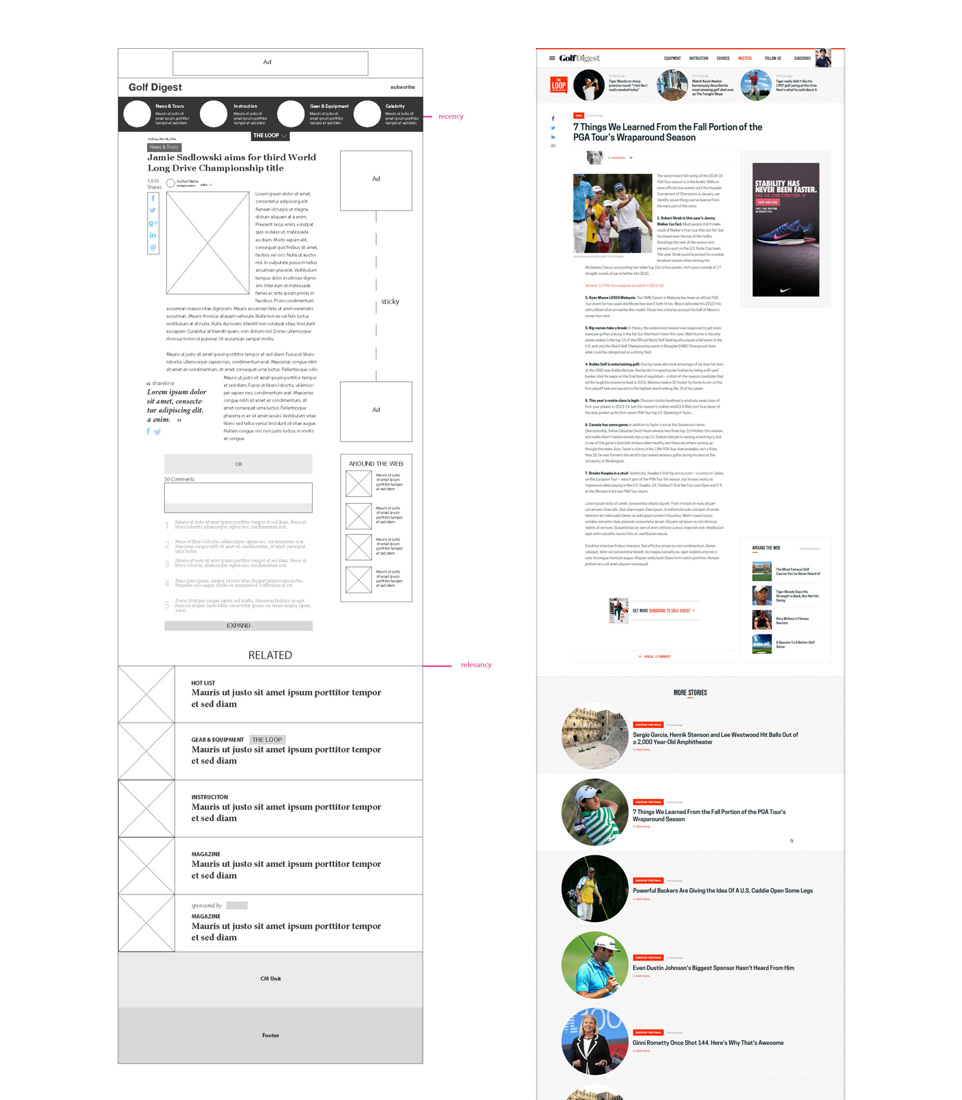
BLOG
Fresh and Light
Daily blogs focusing on the golf news, health, styles and celebrities
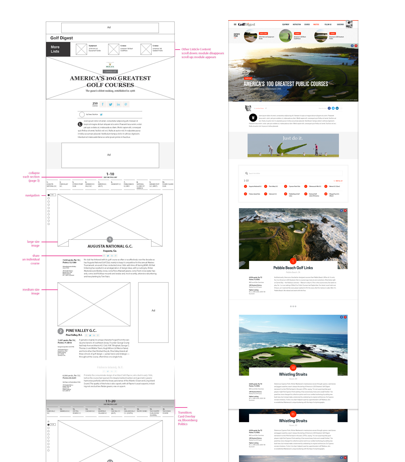
LONG-FORM
Authentic and Special
Annual rankings of golf courses and destinations, like "The 100 Greatest" or "GD Editor's Choice"
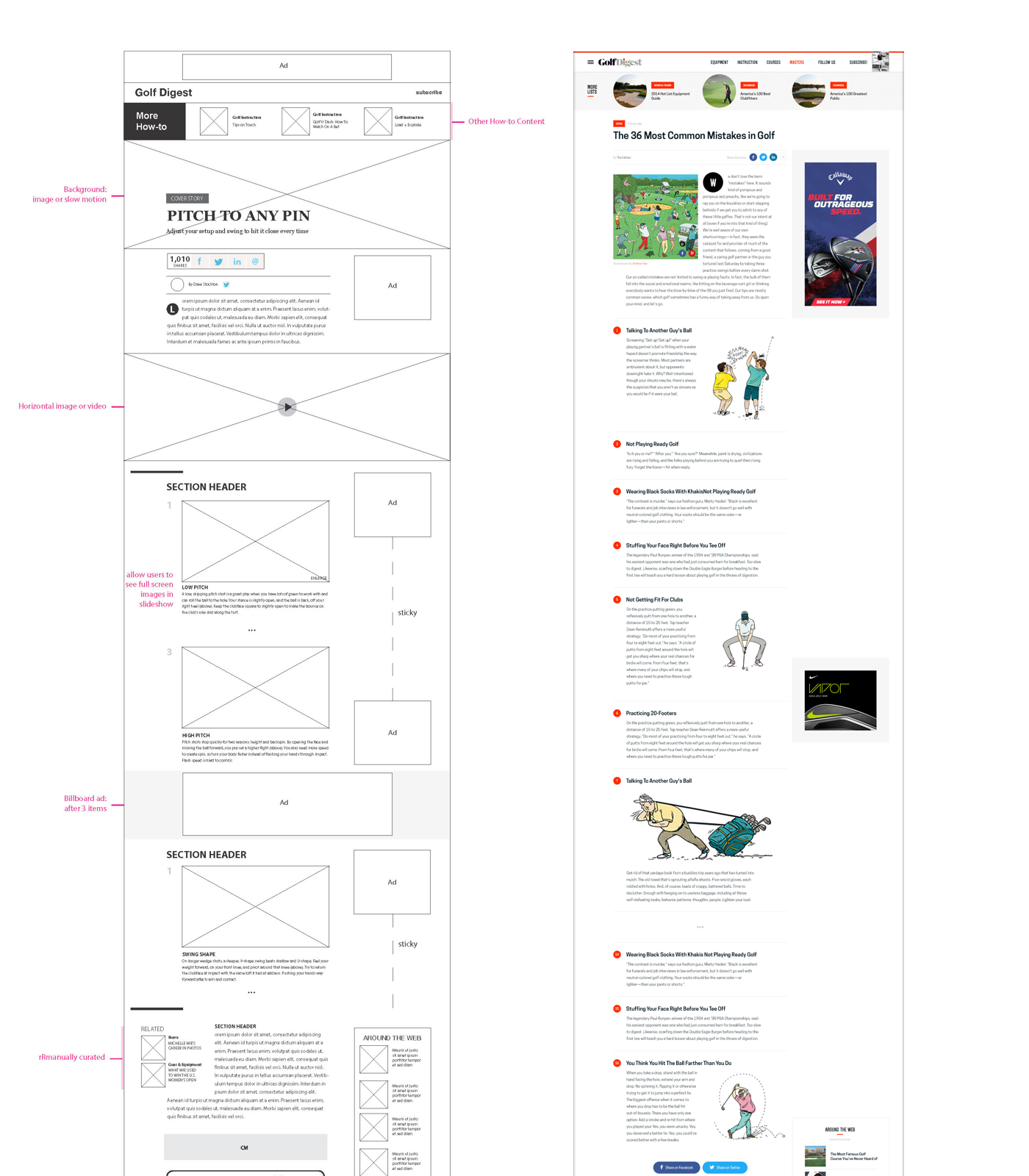
LISTICLE
Instructional
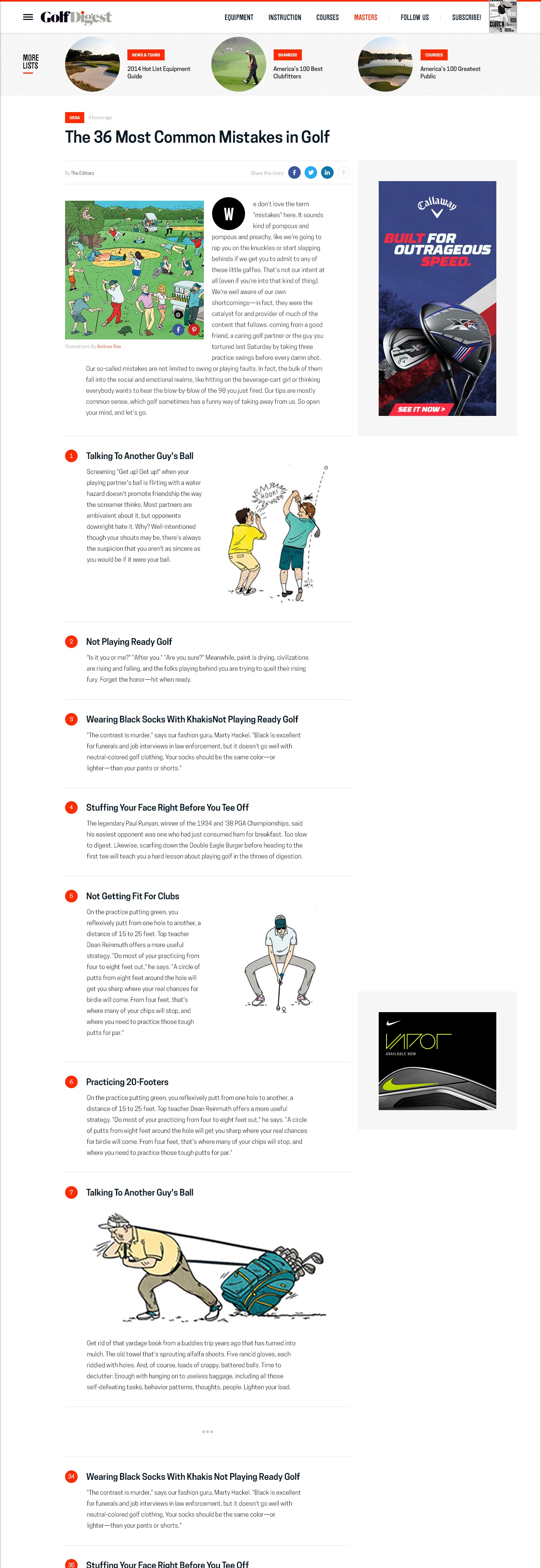
The step-by-step golf playing how-to guides


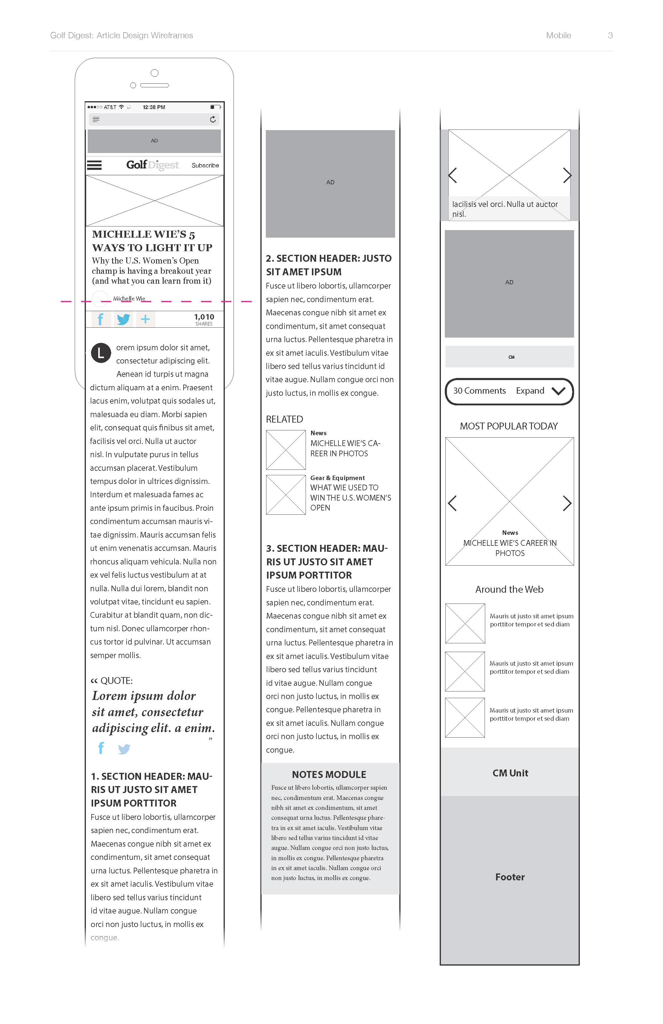
- RESPONSIVE MOBILE -
Before and After
Previous
Redesign
Process
Project Team: 1 Visual Designer and 2 UX Designers
As UX designer in Golf Digest redesign team, in charge of the UX process of content template redesign, including blogs, articles, long-forms and listicles.
1. Data Analysis
Collaborating with Analytics team, summarized and defined Golf Digest’s two user groups
Loyal users:
Frequently visit Golf Digest's website
Are more interested in “The Loop” blogs and read more than one blog during visits
New users:
Land on Golf Digest by searching golf related keywords on other search engines
More focus on evergreen content like golf equipments, instructions or courses
2. Content Analysis
Analyzed Golf Digest’s website based on its content types, layouts, update frequency and user groups
Before redesign: 6 templates
Standard article, Article with a list, Article mixed with sub channel, Standard article with how-to module, Blog template and Long form article
Redesign: 4 templates
Article (evergreen content), Blog (news), Long-form (special packages), Listicle (how-to tutorial)
3. Wireframe
Starting from paper sketch, narrowed down the concepts for the four content templates
Created low and medium fidelity responsive wireframes for desktop and mobile
Finalized UX concepts and delivered to visual design
4. Visual Design
Closely collaborated with visual designers to transform wireframes to visual design
5. Global Style Sheet
Systemized visual treatments into a global style sheet (with CSS code)
Style names
CSS styles (font, size, color, alignment, spacing, decoration)
Breakpoints
Visual screenshots
- More Related Projects -
CNT Redesign
Epicurious Profile
Glamour Oscar


