LOGIN/REGISTER & PROFILE RECIPE BOX
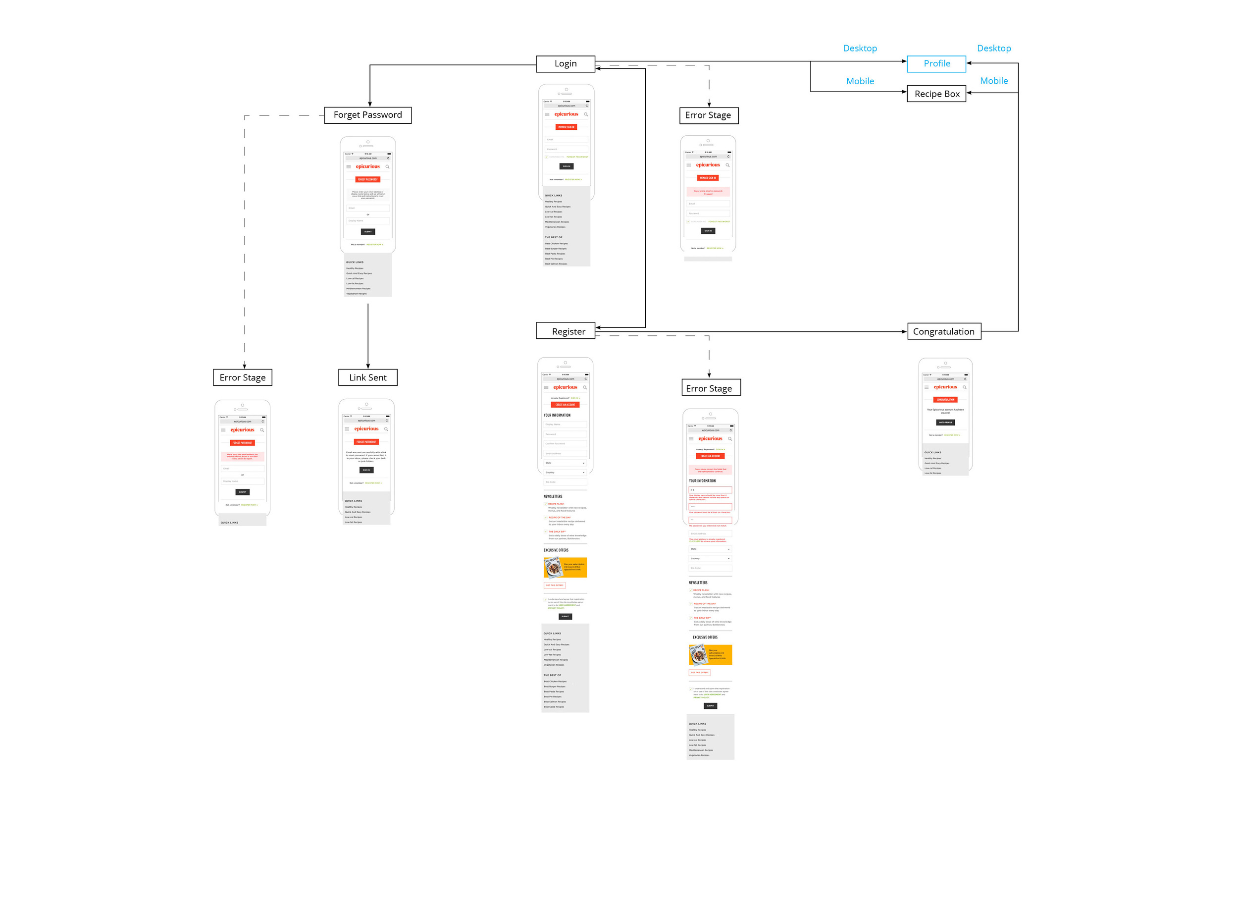
Epicurious Profile User flow
Webby Award 2015 Best Websites Food & Drink, People's voice and nominee
As one of the largest food resources sites, Epicurious has more than 8 million monthly unique visitors. How to convert visitors to Epicurious registered users and provide a useful recipe tool for them are the challenges of the site redesign.
This project is to clean up and design the key features of Epicurious account center, login, profile and recipe box.
Date: 2014
Slideshow, Registration, Recipe Box
UX + Visual Designer: Yanwen Hu
My Role:
Competitive Analysis
Taxonomy, Site Structure, User Flow
Wireframe, Prototype
Visual Design
Visual Spec
- User Flow -
Login/Register
- SITE STRUCTURE -
Issues Of Previous Structure
Unclear Hierarchy
Same page appears on the structure's first and second levels
Sub-navigation is not consistent, which keeps changing on different pages
Redundancy
Same feature appears on multiple index pages
Less Visited Content
Some low traffic pages have less content
Previous
Redesign
- Login -
Previous
Redesign
- Register -
Previous
Redesign
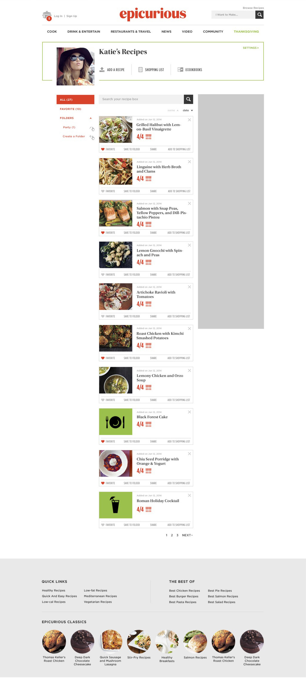
- Profile -
Previous
Redesign
- Recipe Box -
- Related Projects -
Epicurious Slideshow
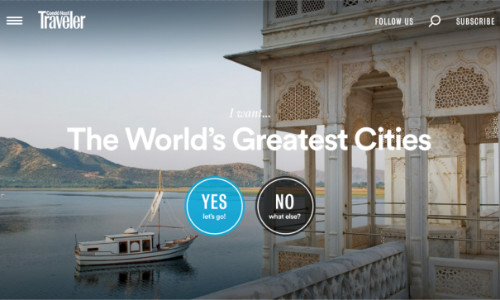
CNT Redesign
Lucky Slideshow


