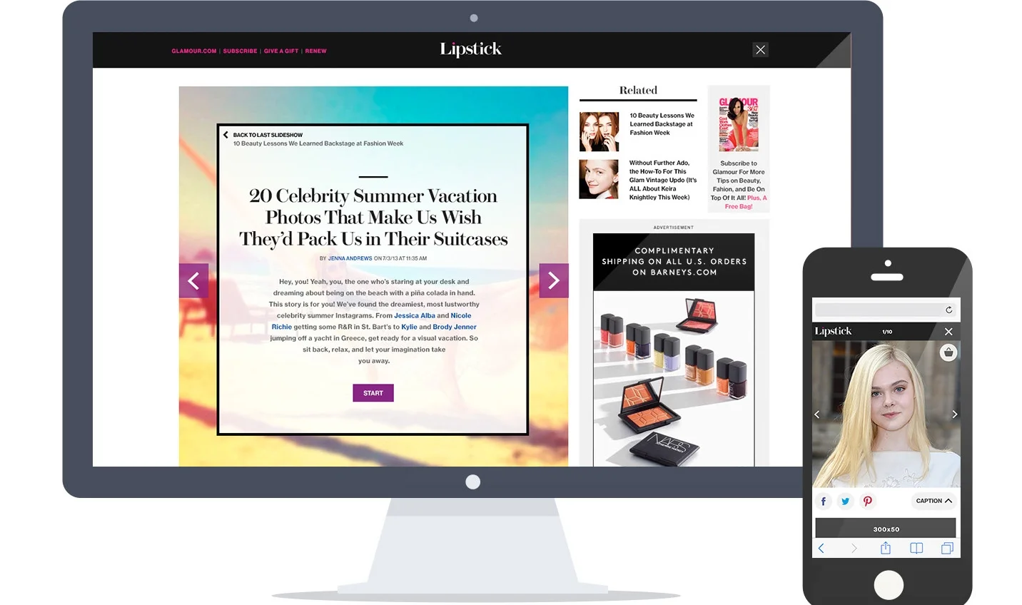
Lipstick Slideshow
- Responsive Design
As one of the highest traffic templates on the site, the slideshow is a key place that has a crucial need for a better user experience. Focusing on the visual-driven concept of Lipstick design, the slideshow template embraces large inspiring beauty images and chic graphical elements that coincidence with other pages on Lipstick.com. It also creates an opportunity to incorporate "Shop This Look," an editorial e-commerce module, into the content experience. When browsing the slideshows, users can find what products the models were using in the pictures, and directly purchase them on Glamour's online shop.
UX + Visual Designer: Yanwen Hu
My Role:
Competitive Analysis
User Experience Design:
User Flow, Wireframe, Prototype
Visual Design
User Testing
Desktop
Mobile
Design Concepts
Sticky to the next slideshow
decrease the bounce rate of slideshow templates
no ending slide at the last page of the slideshow: it will bring users to the next related slideshow directly
merge the ending slide with the intro slide: the goal is to keep users focusing on the new slideshow while still providing "the related slideshows" and "back to previous" these options
Shop This Look
allow users to purchase what they have seen on the slides
explore another shopping use case which is different from "Editor's picks" module on index pages
PROCESS
UX + Visual Designer: Yanwen Hu
As a designer in Lipstick design team, individually designed slideshow template from beginning to the end.
Competitive Analysis
Analyzed slideshow templates of other competitive sites and combined them into three user flows:
directly get to a slideshow template
first reach an intro article of slideshow, and then get to the slideshow content by clicking the "view slideshow" button
get to the embedded slideshow on an article, and also allow users to have a full screen experience
Desktop Interaction
built and cleaned up the previous user flow of the slideshow template
created wireframes and tested the performances of different modules: intro cards, ending slides, social shares and the recirculation module
designed high-fidelity prototypes for design reviews
Mobile Interaction
Competitive Analysis
- studied mobile slideshow interaction of multiple sites
- analyzed different use cases, features and interactions
Mobile User Flow
Visual Design
Prototype
designed desktop and mobile responsive slideshow templates
created an interactive prototype for pre-launch user testing
User Testing
tested interaction features on both desktop and mobile:
desktop: users prefer to have an intro screen and appreciate the interaction of stitching to the next slideshow
mobile: users like "shop this look" feature and having social buttons to be explored
new learning: users might click "x" to exit the slideshow by mistakes on the caption overlay, while their intentions are to close the caption
Before:
4 solutions of closing caption interaction:


